Planforge Blog
  • Software
  • Solutions
  • Pricing
  • Experience
  • Resources
  • en
  • de
 
  • en
  • de
  • Software
  • Solutions
  • Pricing
  • Experience
  • Resources
Back to menu

Software

  • Project Management From project start to completion
  • Program Management Control complex programs easily
  • Portfolio Management Analyze projects and programs
  • Resource Management Plan capacities optimally
  • Strategic Management Implement visions successfully
  • Enterprise Agile Planning All ARTs and PIs in one tool

Software Overview

Back to menu

Solutions

  • Project Management Office All tools for your PMO
  • Lean Project Management Making daily project work easier
  • New Product Development Faster Time-To-Market

All Solutions

Integrations

Jira Confluence SAP API

All Integrations

Back to menu
Back to menu

Experience

  • References
  • Planforge is a Gartner Leader
  • Success Stories
  • Discover Planforge in a demo

Become a part of +25,000 users

Back to menu

About us

  • About the company
  • News from Planforge
  • Press Information

Learn more about Planforge

Resources

Getting Started Guide Downloads FAQ

To the PM blog

May 30, 2019

Milestone Trend Analysis: How to Analyze Your Stage Wins

Milestones mark important dates within a project. The Milestone Trend Analysis (MTA) visualizes whether these dates are met or postponed. In this article, you will learn how to interpret the MTA easily.

Gerald Aquila

Gerald Aquila

298 words • 3 minutes

Share on: Auf LinkedIn teilen Tweet Auf Facebook teilen

What is a Milestone Trend Analysis?

The "colored" lines are, above all, one thing: an essential controlling and early warning tool in project management. The MTA visualizes the defined milestones over time: from the start to the planned end date. Professional software tools create an MTA automatically.

milestone-trend-analysis-Software-by-Planforge

The horizontal axis is subdivided into reporting times, e.g., weeks or months, depending on the average duration of your projects. The vertical axis represents the date of each milestone at each checkpoint. Connecting lines can be used to detect delays early and to derive trends - where appropriate, measures can be taken to ensure compliance with deadlines.

How to Analyze the MTA

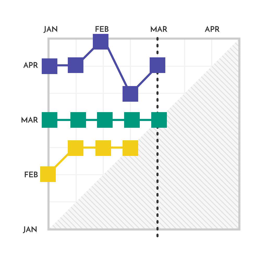
What do the various trend patterns shown represented in the MTA mean?

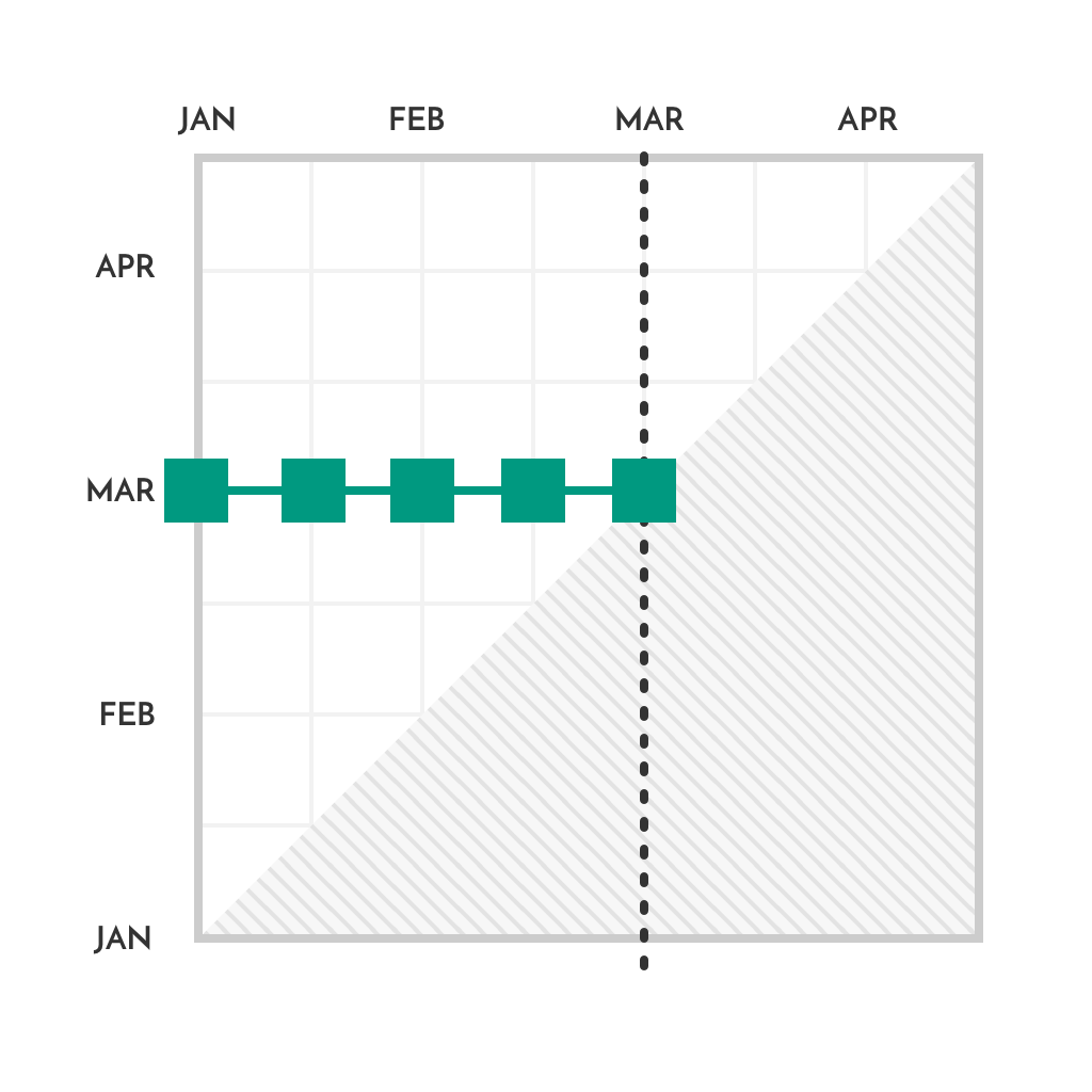
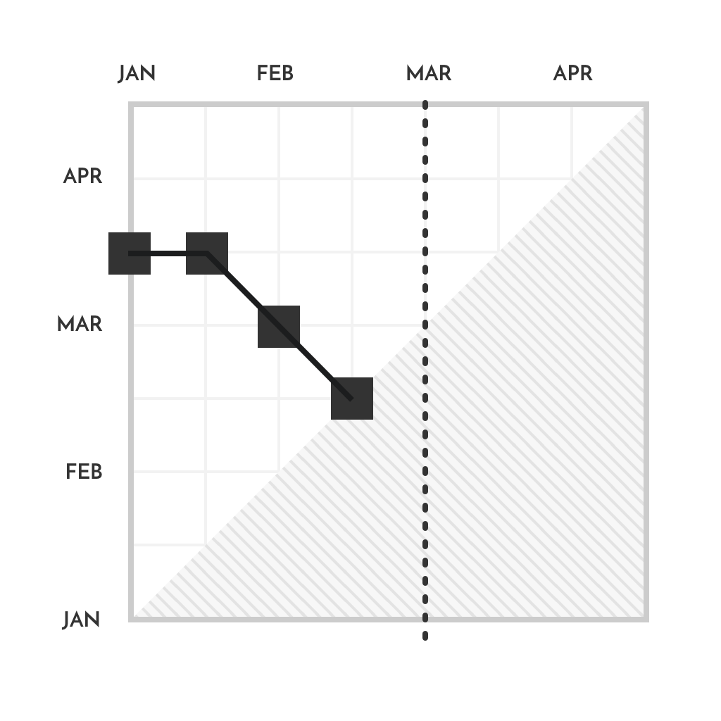
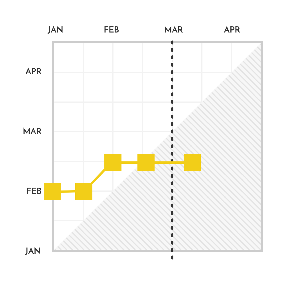
1. Horizontal lines in the milestone trend chart: everything is according to the plan, and the deadlines are met

mta-plan

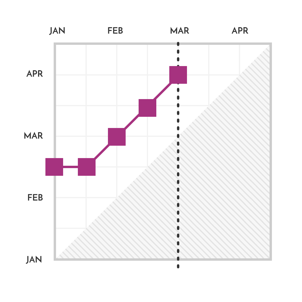
2. Uptrend or rising lines in the milestone trend chart: delay of the milestone date

mta-delay-milestone-trend-analysis-Software-by-Planforge

3. Non-linear trend: unrealistic milestone date

mta-unrealistic-milestone-trend-analysis-Software-by-Planforge

4. Downtrend or falling lines in the milestone trend chart: earlier completion of the milestone and the planned safety buffer is too large

mta-safety-milestone-trend-analysis-Software-by-Planforge

Article: Buffer Management

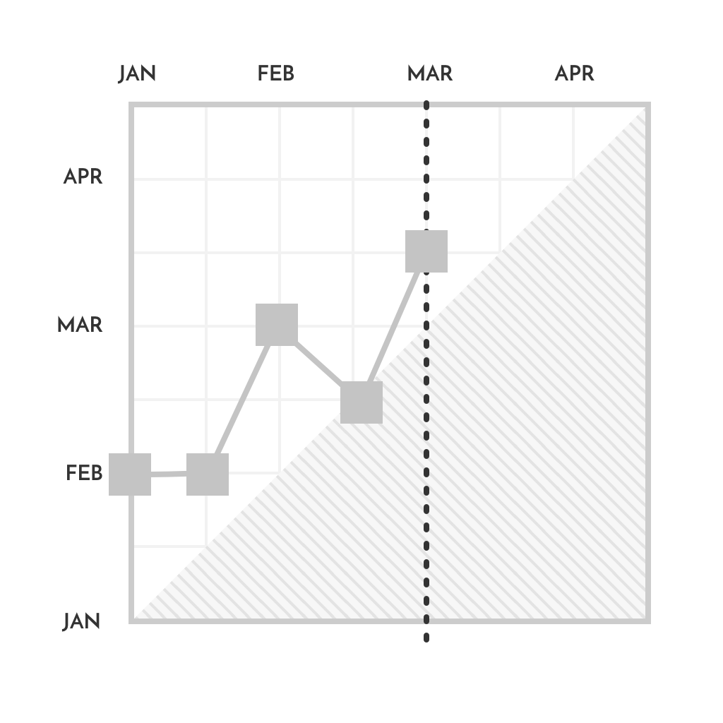
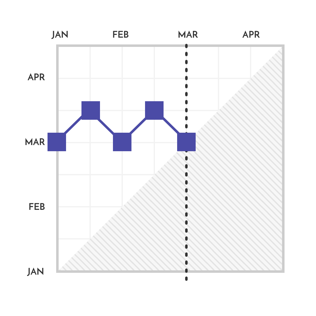
5. Zigzag trend: usually indicates many uncertainties in the schedule

mta-uncertainties-milestone-trend-analysis-Software-by-Planforge

What Is the Gray Zone?

When a milestone reaches the gray zone, either this milestone has not been reached, or the milestone plan has not been kept up to date.

mta-grey-area-milestone-trend-analysis-Software-by-Planforge

For an efficient milestone trend analysis, it is crucial to ensure that milestones and their progress are updated and reviewed regularly at pre-defined reporting dates. The trend patterns are meaningful and can fulfill their purpose as an essential controlling and early warning instrument.

Relevant Project Management Terms

Milestone

A milestone is a verifiable event without duration and activity. The setting of such milestones, or intermediate goals, facilitates project planning and project controlling.

Milestone Trend Analysis MTA

Milestone trend analysis, also known as MTA for short, is a method used to control the achievement of milestones or adherence to deadlines in a project. The MTA visualizes the defined milestones from the start to the planned finish date. The horizontal axis is divided into reporting dates, for example weeks or months. The vertical axis represents the date of each milestone at each checkpoint. Various trends can be identified when using connecting lines.

Glossary

Planforge Blog
Software
  • Project Management
  • Portfolio Management
  • Program Management
  • Resource Management
  • Strategic Management
  • Enterprise Agile Planning
Solutions
  • Project Management Office
  • Lean Project Management
  • New Product Development
Integrations
  • API
  • Jira
  • Confluence
  • SAP
Experience
  • References
  • Success Stories
All about Planforge
  • Company
  • Partners
  • Jobs
  • News
  • Press
ONEPOINT Projects GmbH

Dietrich-Keller-Strasse 24/6
8074 Raaba-Grambach (Graz), Austria
+43 (316) 267 267 0

ONEPOINT Germany

Mühlenstrasse 13
85778 Haimhausen (Munich), Germany
+49 (81) 33 444 777

ONEPOINT USA

325 W. Washington St. #2225
San Diego, CA 92103, USA
+1 (619) 985 0673

© 2023 ONEPOINT Projects GmbH   info@planforge.io   Imprint   Privacy

li fb o yt tw